Global Irrigation Map
Interactive, zoomable maps with Google Earth
On this page, you can explore the maps we produced.
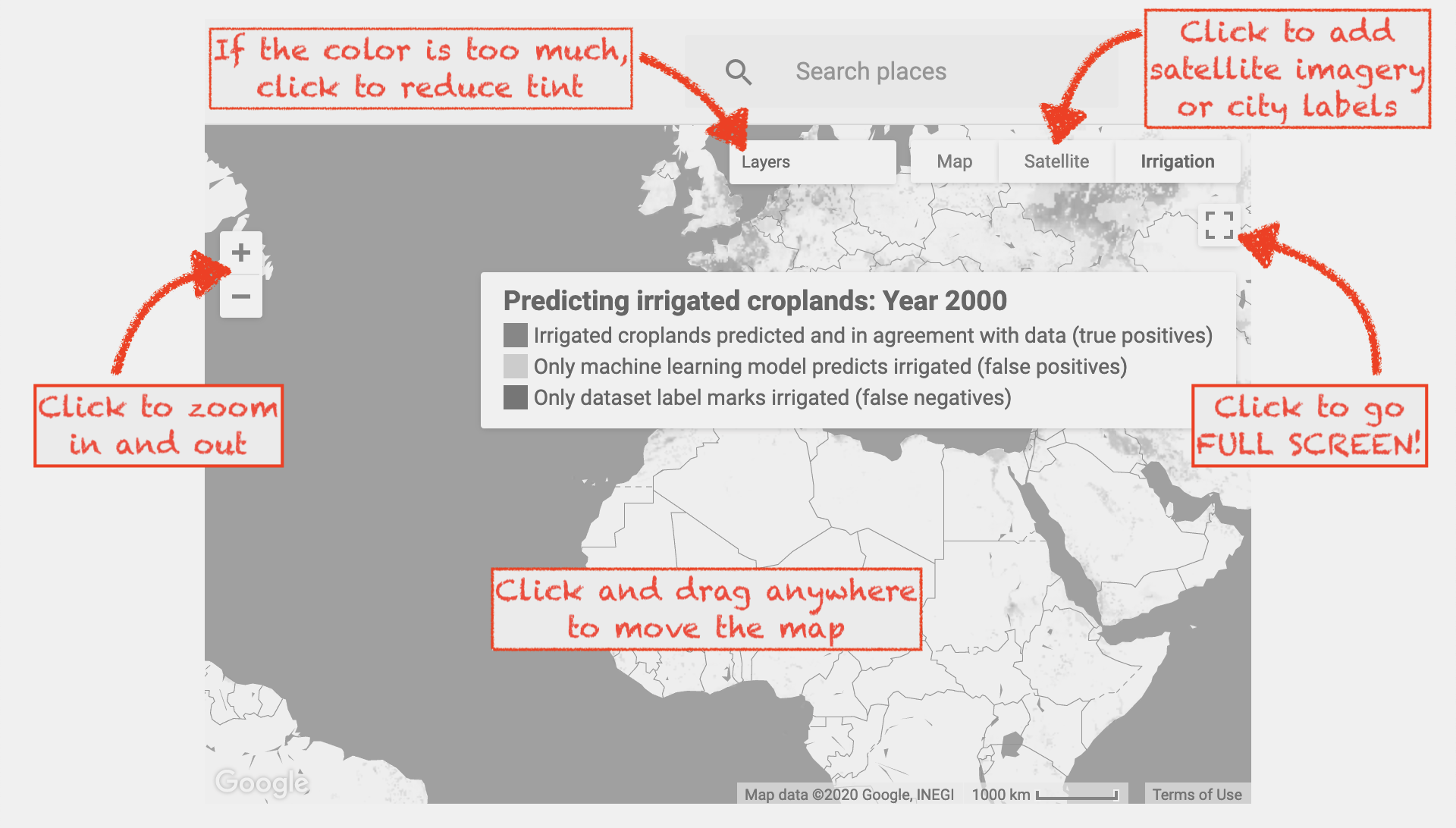
NOTE: Take some time to read the tips below, before you explore the maps.
Extent of Irrigated Croplands, 2000
This map represents the output of our model for the year 2000. As shown in the legend, green areas represent known irrigated farmlands. The model also marks many new areas as irrigated: we have shown such areas in pink. The intensity of color represents the confidence the model has about its detection. We illustrate below some of the themes that emerge from the map. Feel free to zoom in and explore any of the areas indicated.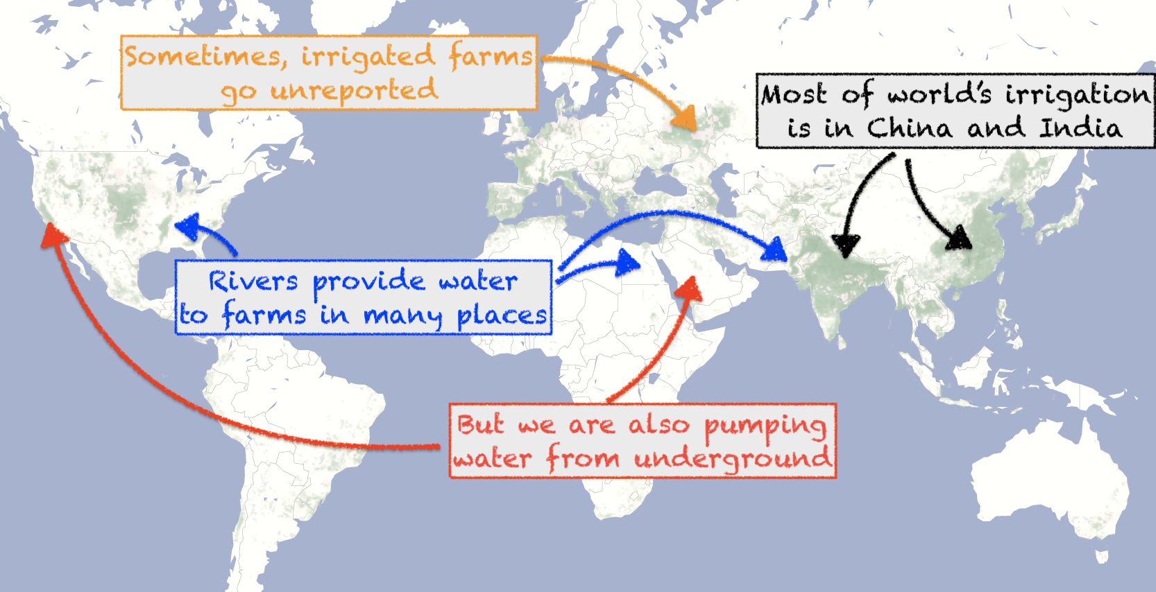
Change in Irrigation, 2000-18
This map shows the difference in croplands between the years 2000 and 2018. Newly irrigated areas are in red, and areas no longer irrigated are in green. As before, the intensity of color represents the degree of change. We again illustrate some of the themes that emerge from the map.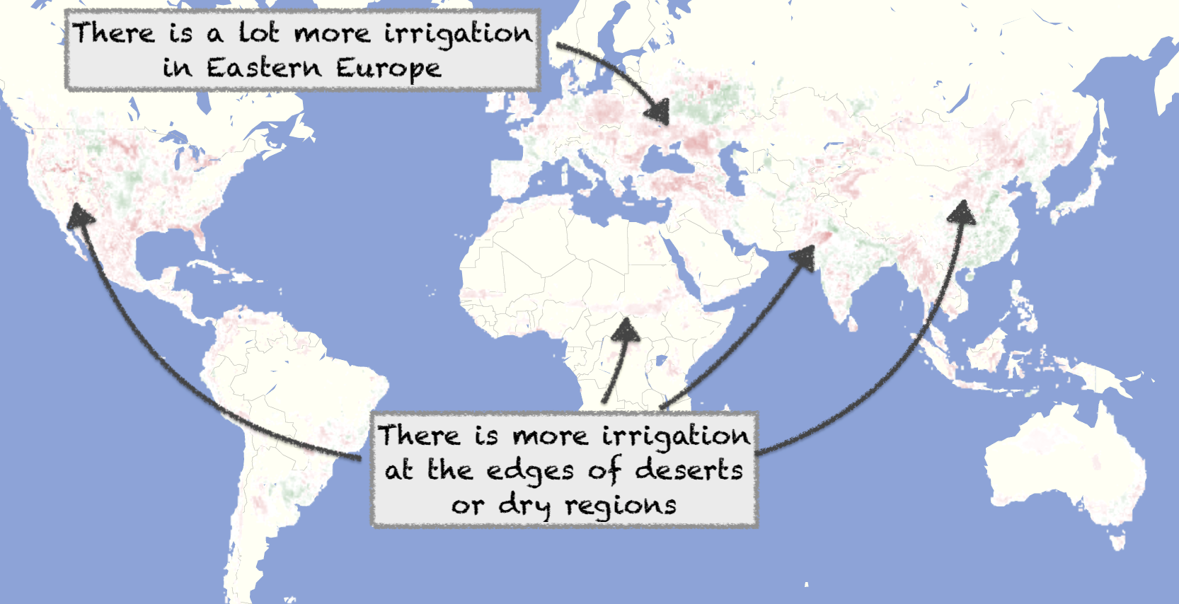
Compare Irrigation
This map uses a sliding pane. You can select 2 years, one for the left and another for the right. Then use the slider in the middle to see how the map changes for those years.Development Preview
Caution: This area is under construction and subject to change!
We are developing another machine learning model that is more accurate than the previous one. This also is at higher resolution. Here we show a preview of its output for 2 years.